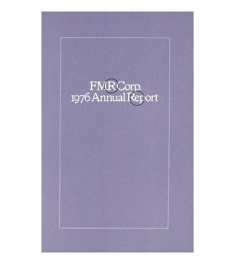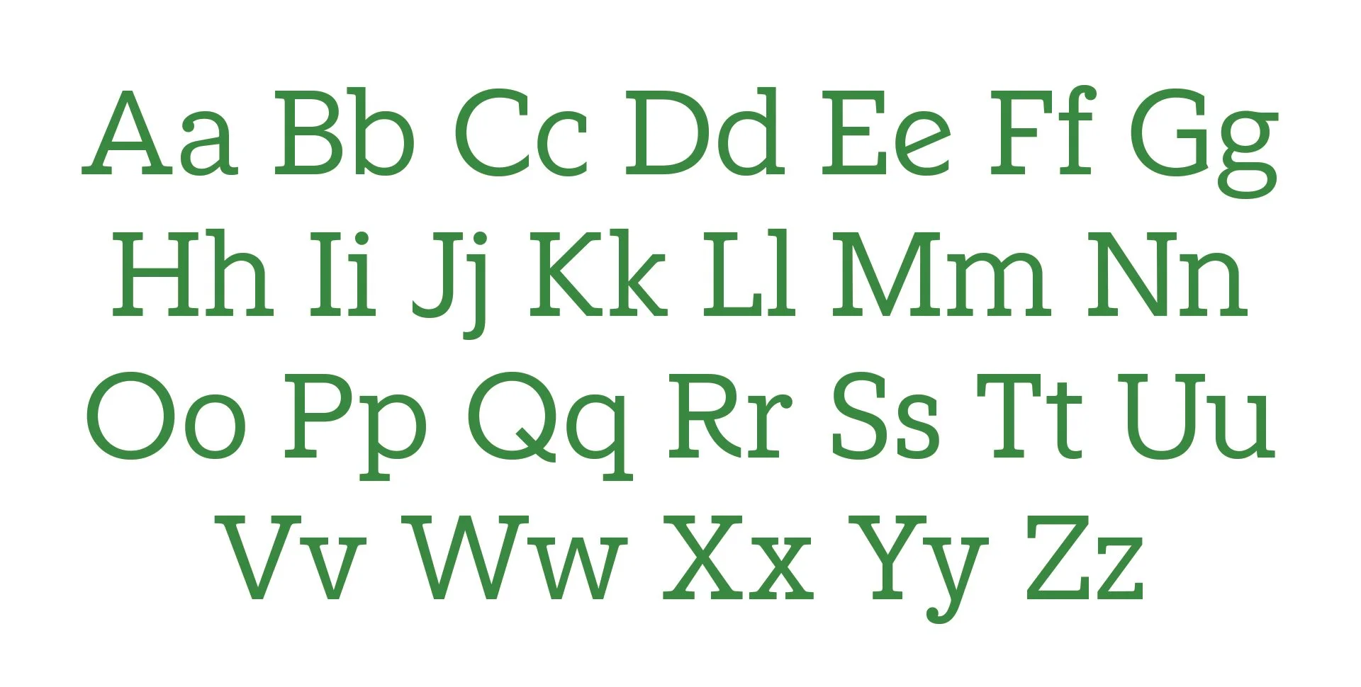


Heritage‑Driven Impact with Type
We created the Fidelity Slab to give the brand a headline voice with more presence and personality while staying true to its typographic roots. Building from the existing Fidelity Sans Serif, the slab version introduces stronger, more sculpted forms that project confidence and heritage.
By restoring distinctive historical details—like the curved‑leg R and the diagonal‑crossbar e as an optional stylistic set—we reinforced Fidelity’s legacy of craftsmanship and trust. The result is a headline typeface that feels both modern and unmistakably Fidelity: bold enough to lead, familiar enough to belong.