

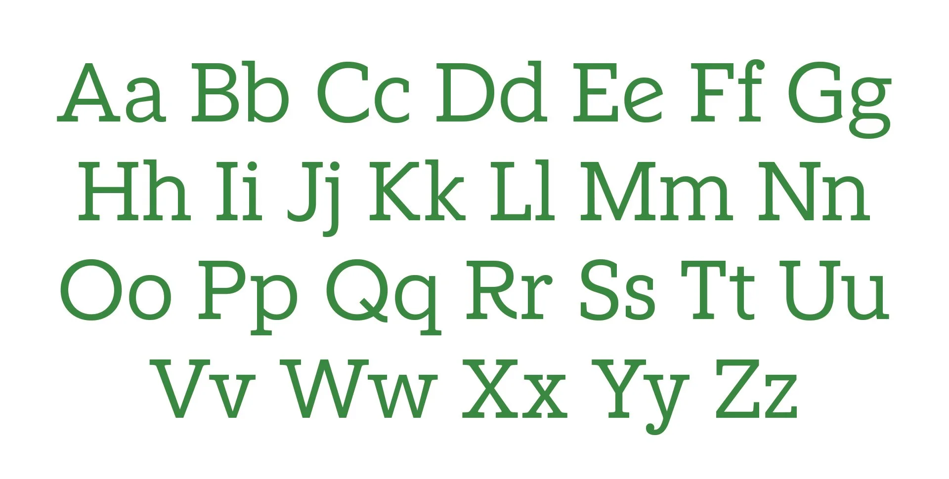
Typography: Fidelity Slab
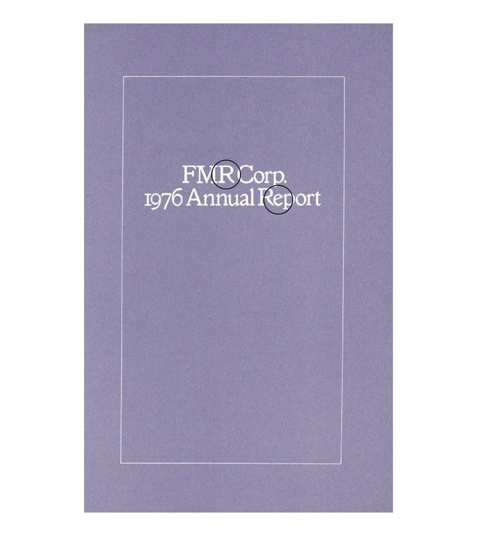
Working with Play Type, I directed the development of a custom typeface — Fidelity Slab — inspired by a 1976 FMR Corp. Annual Report from Fidelity's own archives.
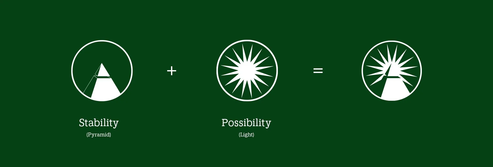
Those letterforms carried a quiet confidence we wanted to bring forward. Designed to complement the existing body typeface, the Slab gives the brand two distinct registers: precise when it needs to be, commanding when it has to be — elevating headlines and brand statements without losing warmth.

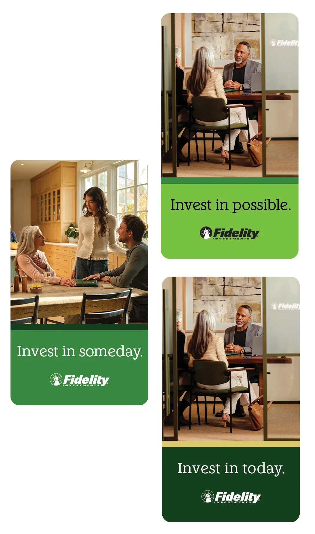
Graphic System
The layout itself tells the story. Each creative unit is built from two parts: a solid band of color anchoring the bottom, and a photograph or video living above it. The color grounds it — steady, structured, unmovable. The image opens it up — a real moment, a real person, a sense of what's ahead.
Together they make the philosophy visible. Stability below. Possibility above. You feel it before you read a word.