
Fidelity
Investments
Brand Refresh and Brand Guideline
ROLE: Creative & Design Director
YEAR: 2025-2026
DISCIPLINE:

THE RESULTS:
THE ASK:
Fidelity Investments is one of the most trusted names in financial services. The ask was to evolve the brand — modernizing it for today while staying true to the values that built it over decades.
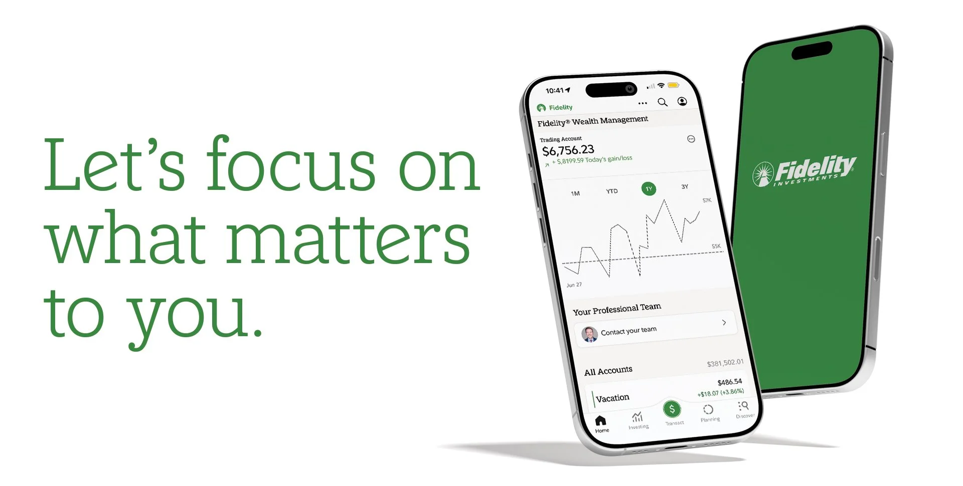
The refresh touched everything: color, typography, graphic system, and photography. Each decision was guided by a single philosophy — From stability, possibility — and designed to feel cohesive, elevated, and unmistakably Fidelity.
14.4K New Households
+7% YOY
$2.78B Total Wealth YTD Revenue
+18% YOY
$101B Gross New Money
+13% YOY



BRAND COLOR:
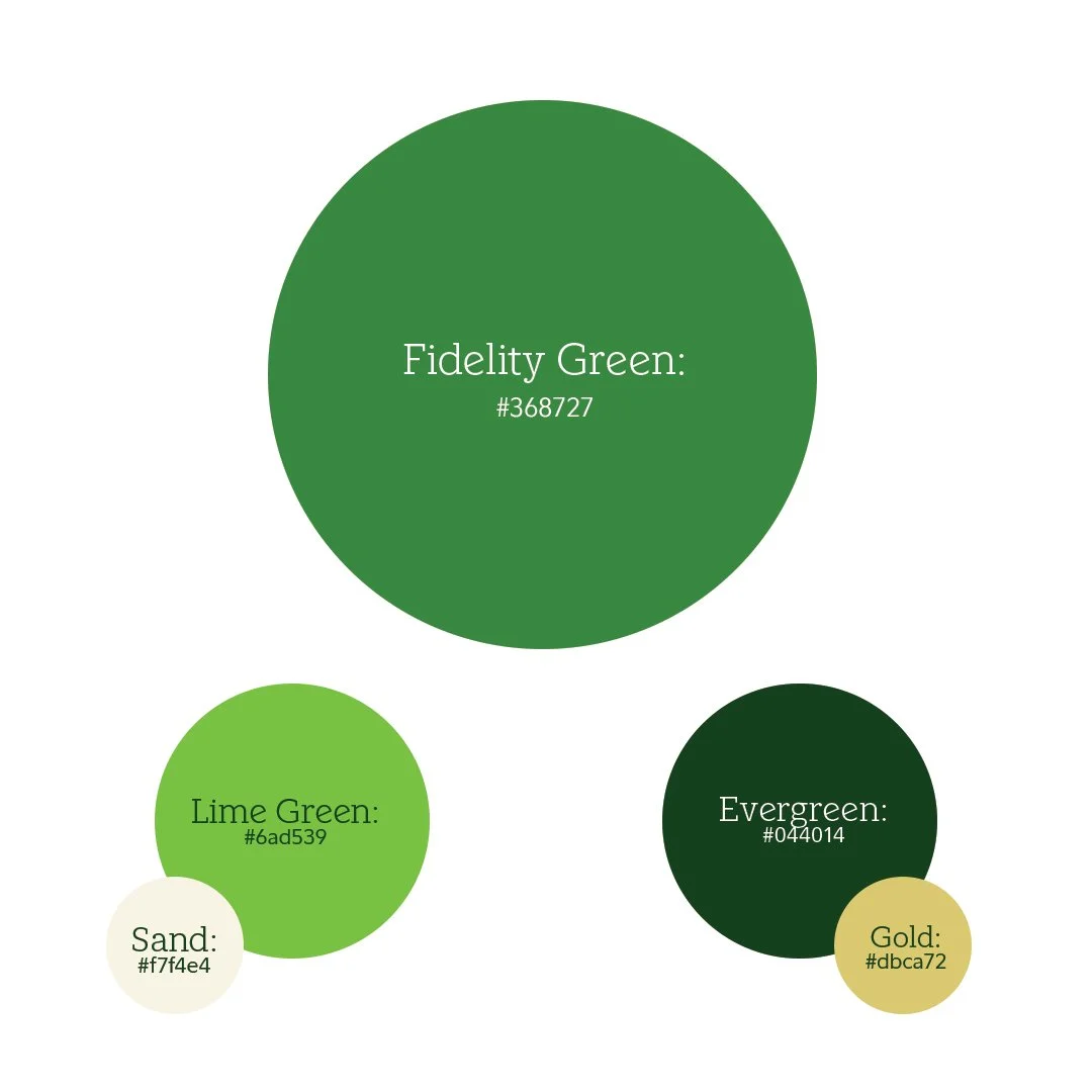
The palette was simplified with purpose. Fidelity Green takes the lead — dominant across all advertising, the color you see first and remember longest.
Lime Green brings energy for youth-focused accounts. Evergreen goes deeper for wealth clients — quieter, more considered. Gold and Sand round it out as warm neutrals that let the greens breathe.
Fewer colors. More intention.

CUSTOM TYPOGRAPHY:
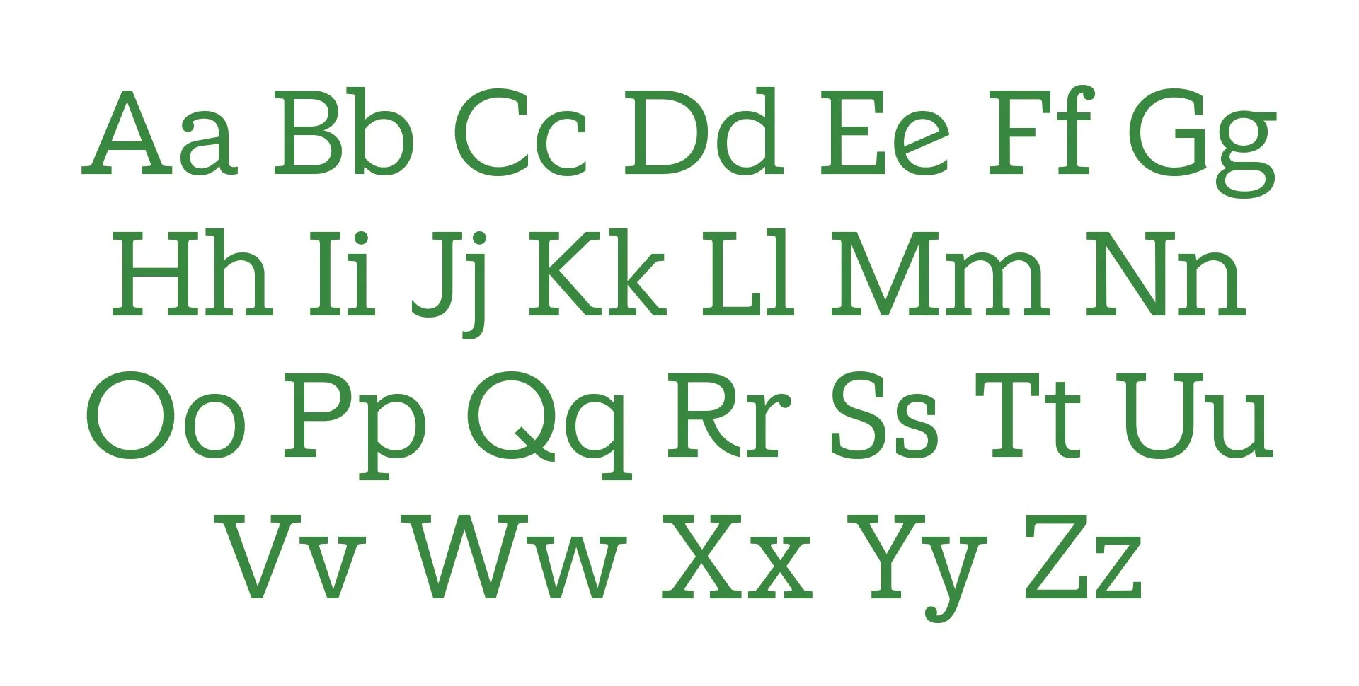
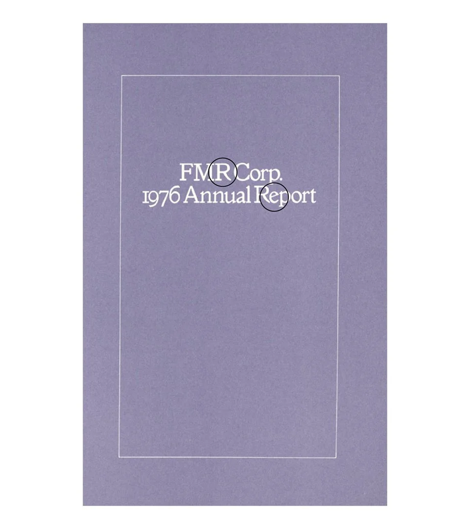
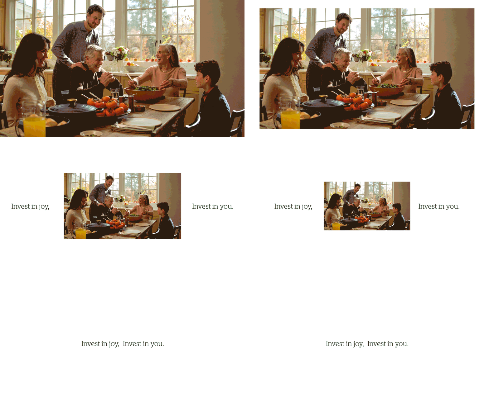
Working with Play Type, I directed the development of a custom typeface — Fidelity Slab — inspired by a 1976 FMR Corp. Annual Report from Fidelity's own archives. Those letterforms carried a quiet confidence we wanted to bring forward.
Designed to complement the existing body typeface, the Slab gives the brand two distinct registers: precise when it needs to be, commanding when it has to be — elevating headlines and brand statements without losing warmth.

GRAPHIC SYSTEM:
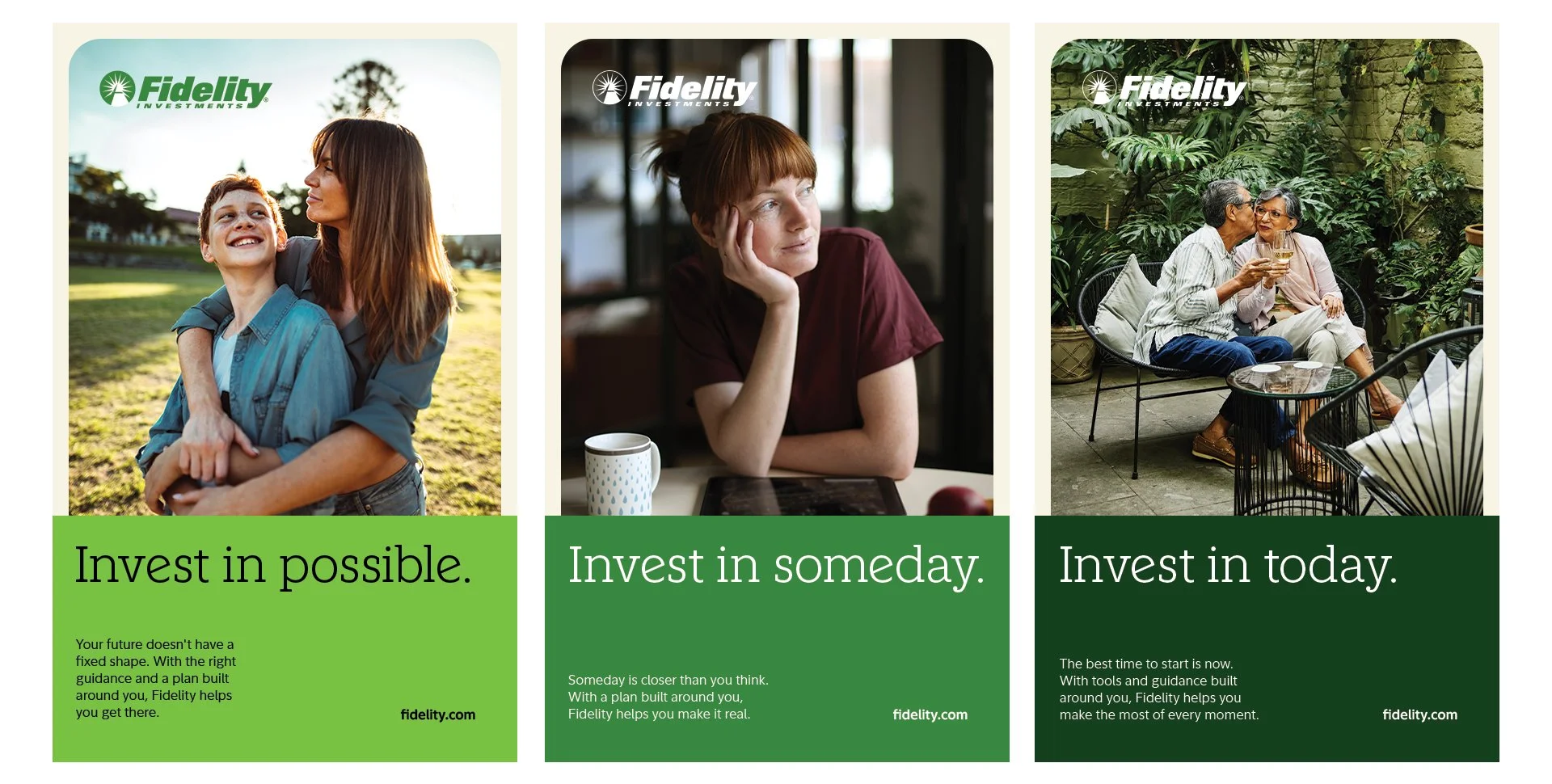
The layout itself tells the story. Each creative unit is built from two parts: a solid band of color anchoring the bottom, and a photograph or video living above it. The color grounds it — steady, structured, unmovable. The image opens it up — a real moment, a real person, a sense of what's ahead.
Together they make the philosophy visible. Stability below. Possibility above. You feel it before you read a word.
BRAND PHOTOGRAPHY:
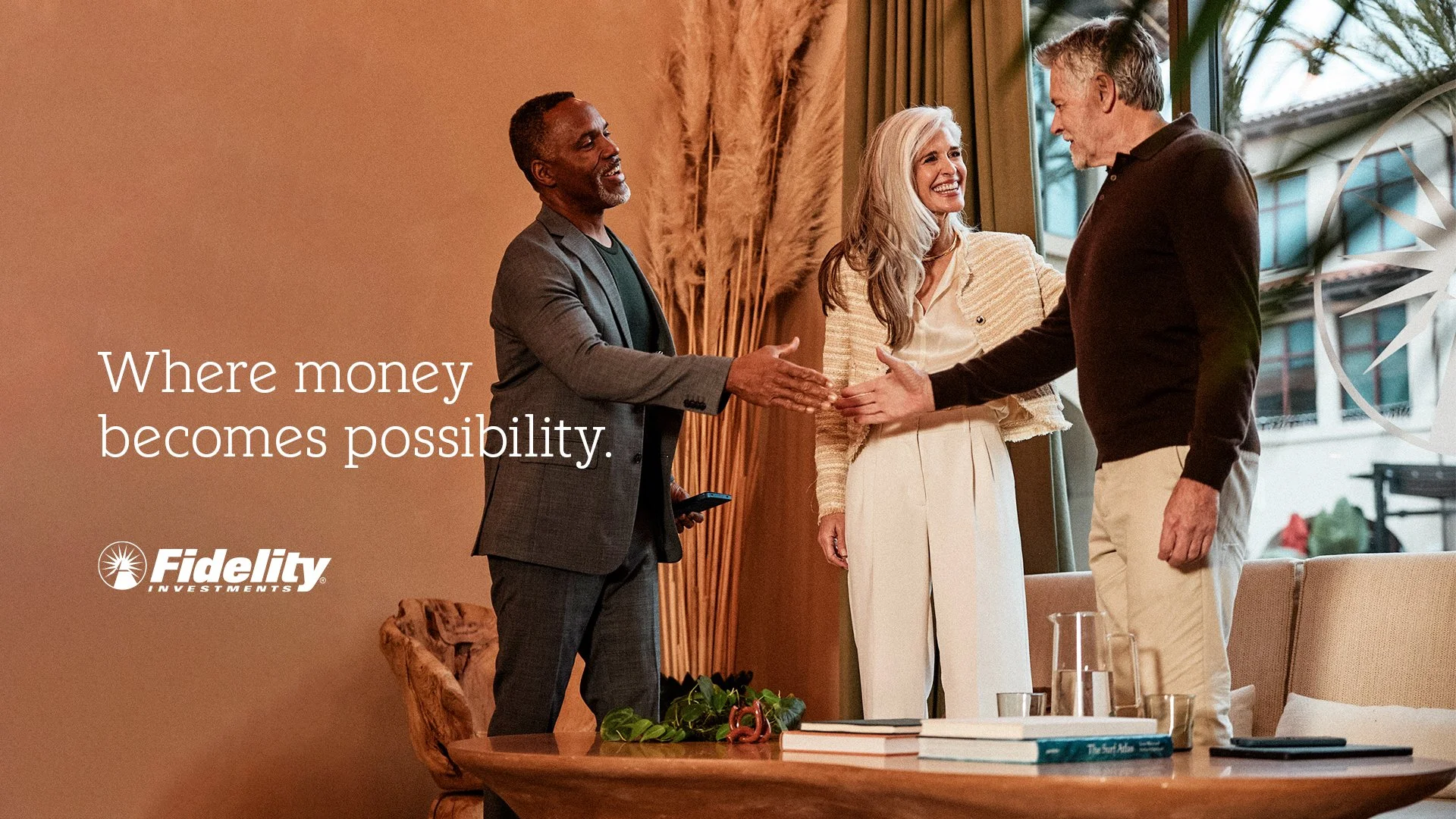
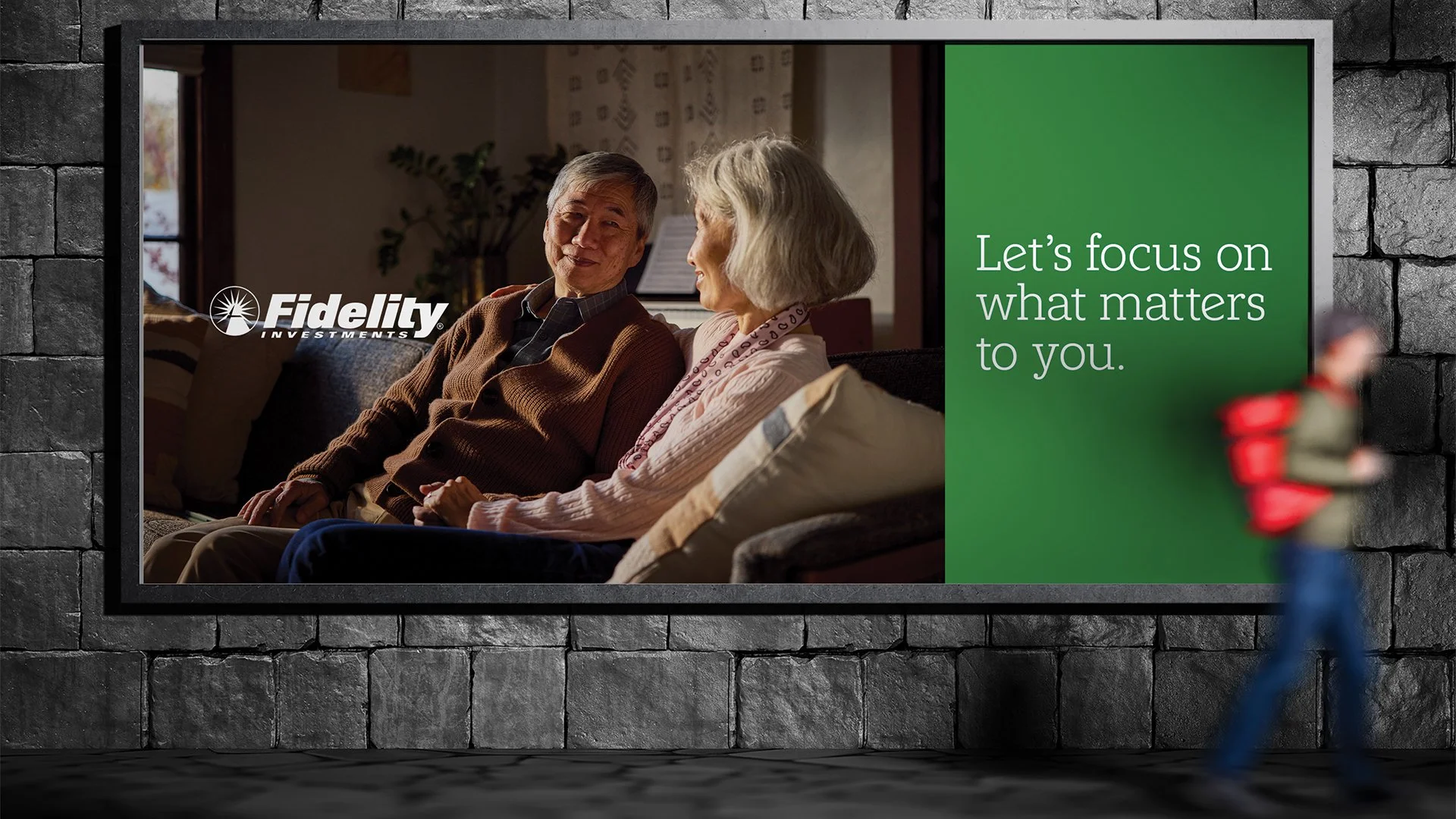
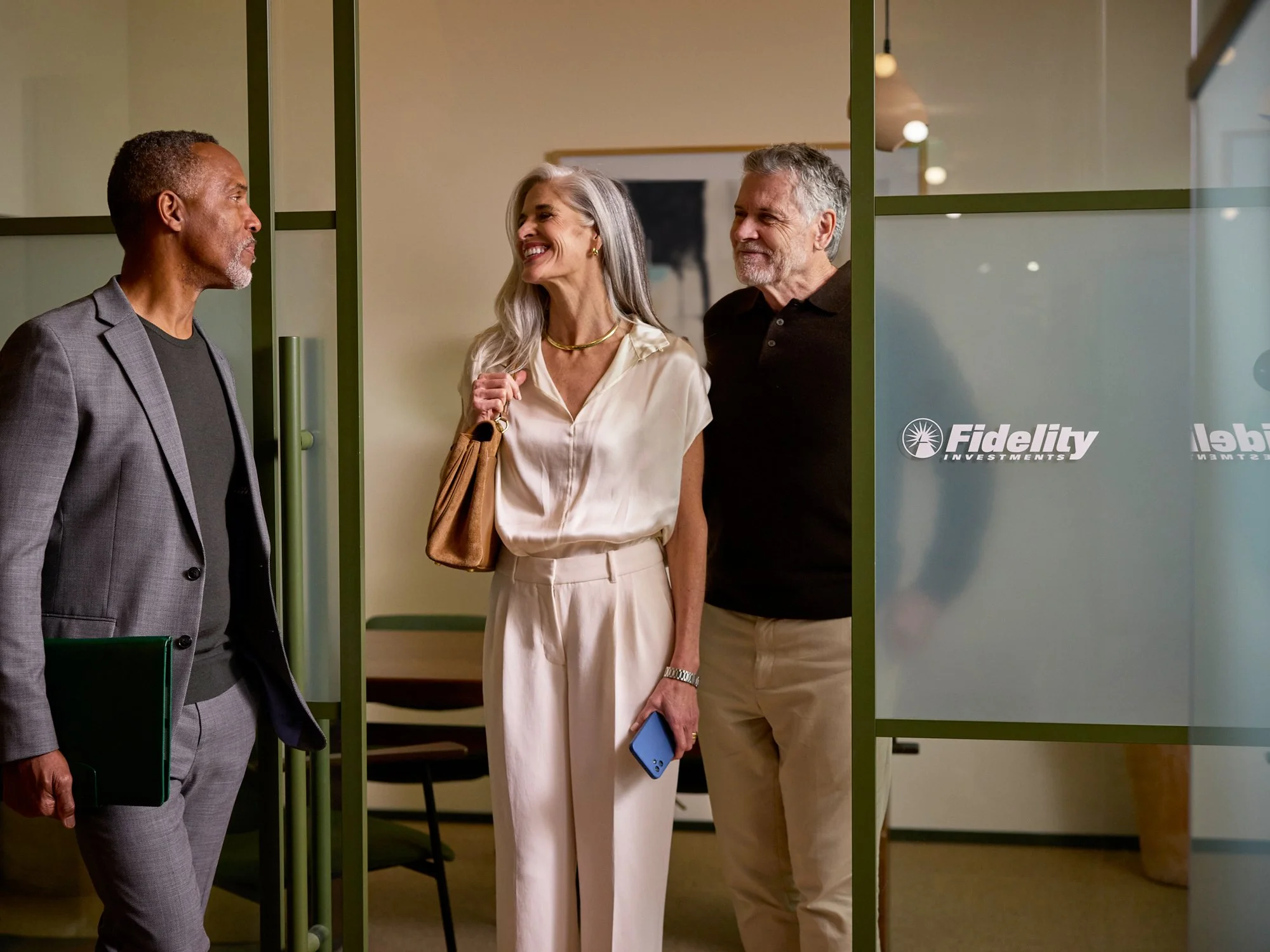
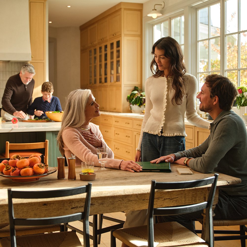
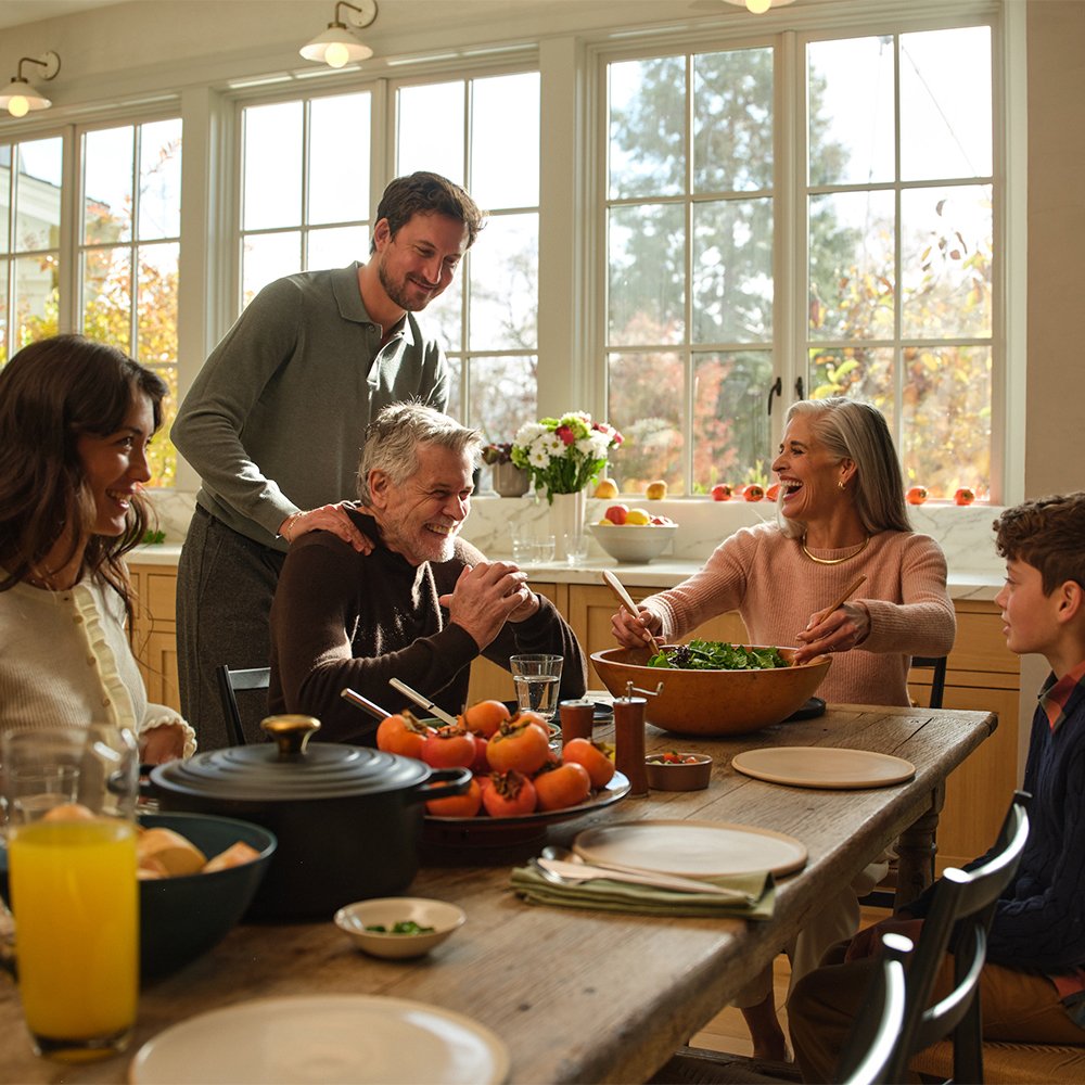
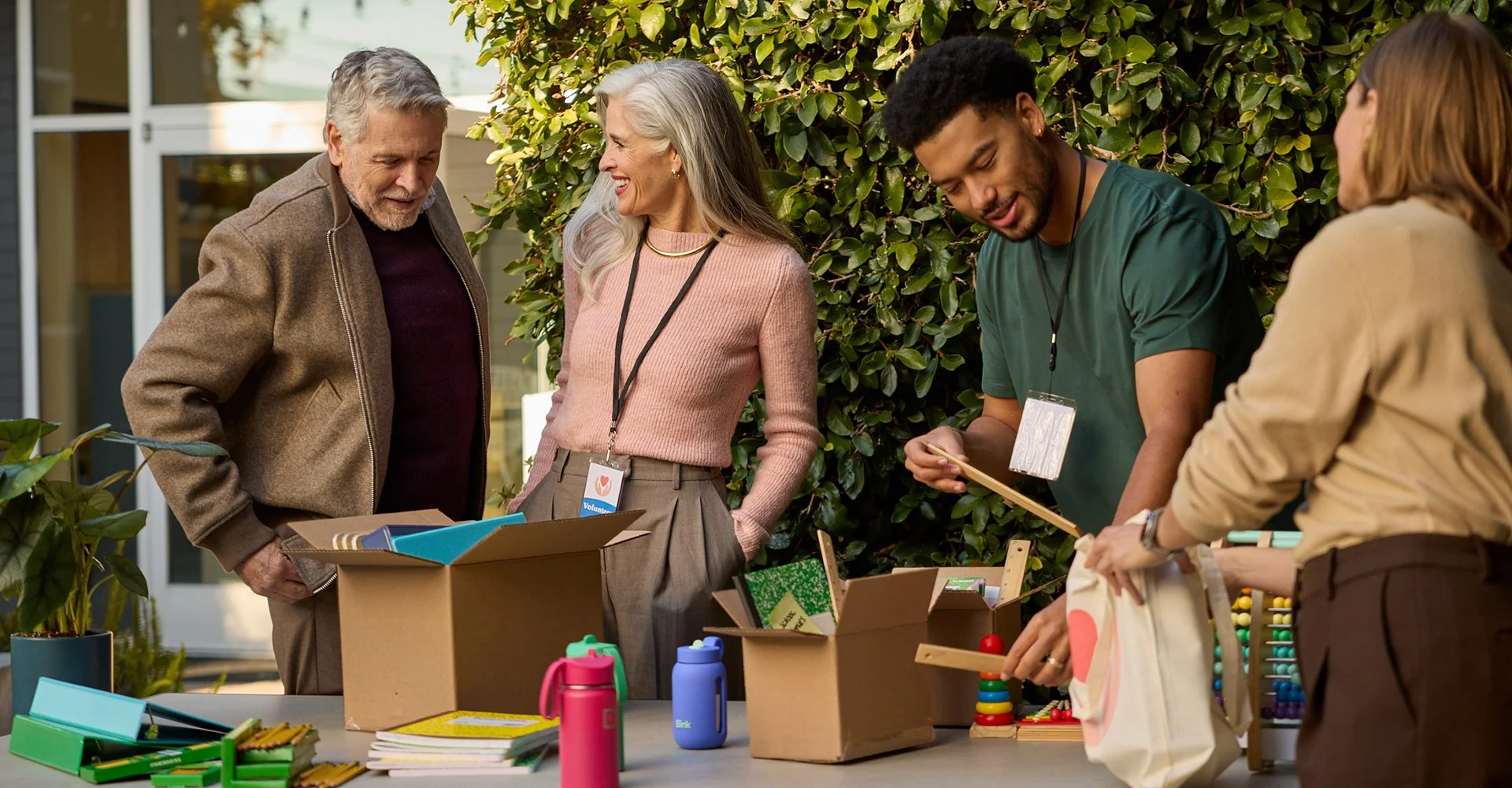
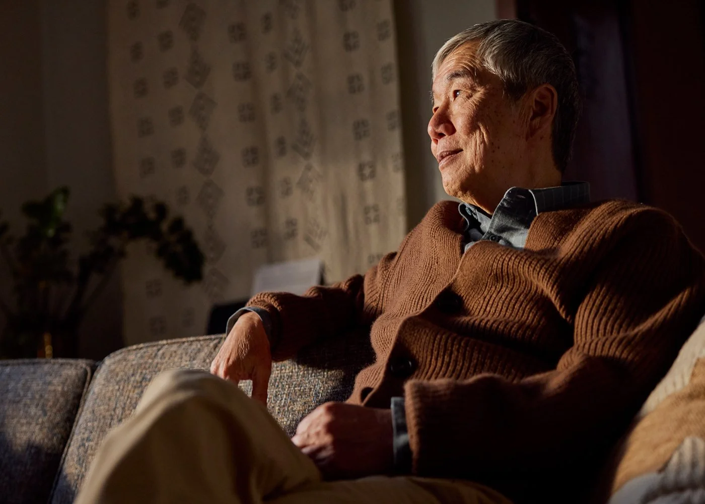
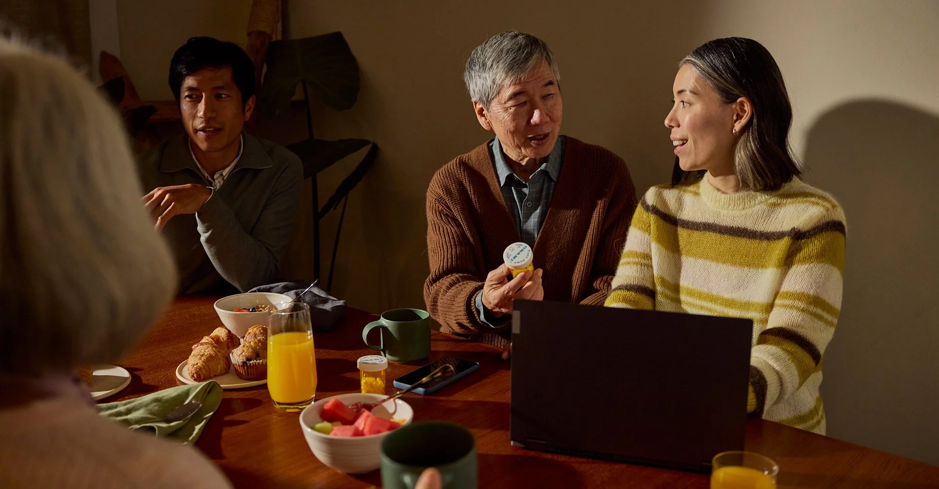
Photography was directed to feel human, inspirational, and real. No perfection, no polish for its own sake — just honest moments that reflect the lives of the people Fidelity serves.
Light plays a key role. We actively sought images shot in golden hour — warm, natural light that gives every photo a distinct glow. It's a simple but powerful way to make the work feel alive and unmistakably Fidelity, never generic, never stock.
This is the possibility half of the equation: warm, alive, and full of forward motion.




MY ROLE: